Has there been any effort to make Sailwave results (summary table together with the individual race results tables) manageable on cell phone sized screens? Using horizontal scroll bars does not work since the leftmost columns(s) (e.g., competitor) are lost when scrolling. We developed a Java application to reformat the results using responsive tables (e.g., tablesaw), but an internal JavaScript effect that reorders the results so that the latest race summary is shown first and the responsive table mechanism that “freezes” specified leftmost columns while allowing the user to scroll back and forth to columns initially not shown. The intent is to not require the external Java application to process the Sailwave results file since future application support may be non-existent.
Should have singed the topic:
Tom Owen
Dahlgren Yacht Club
Hi Tom,
Welcome back after a while away.
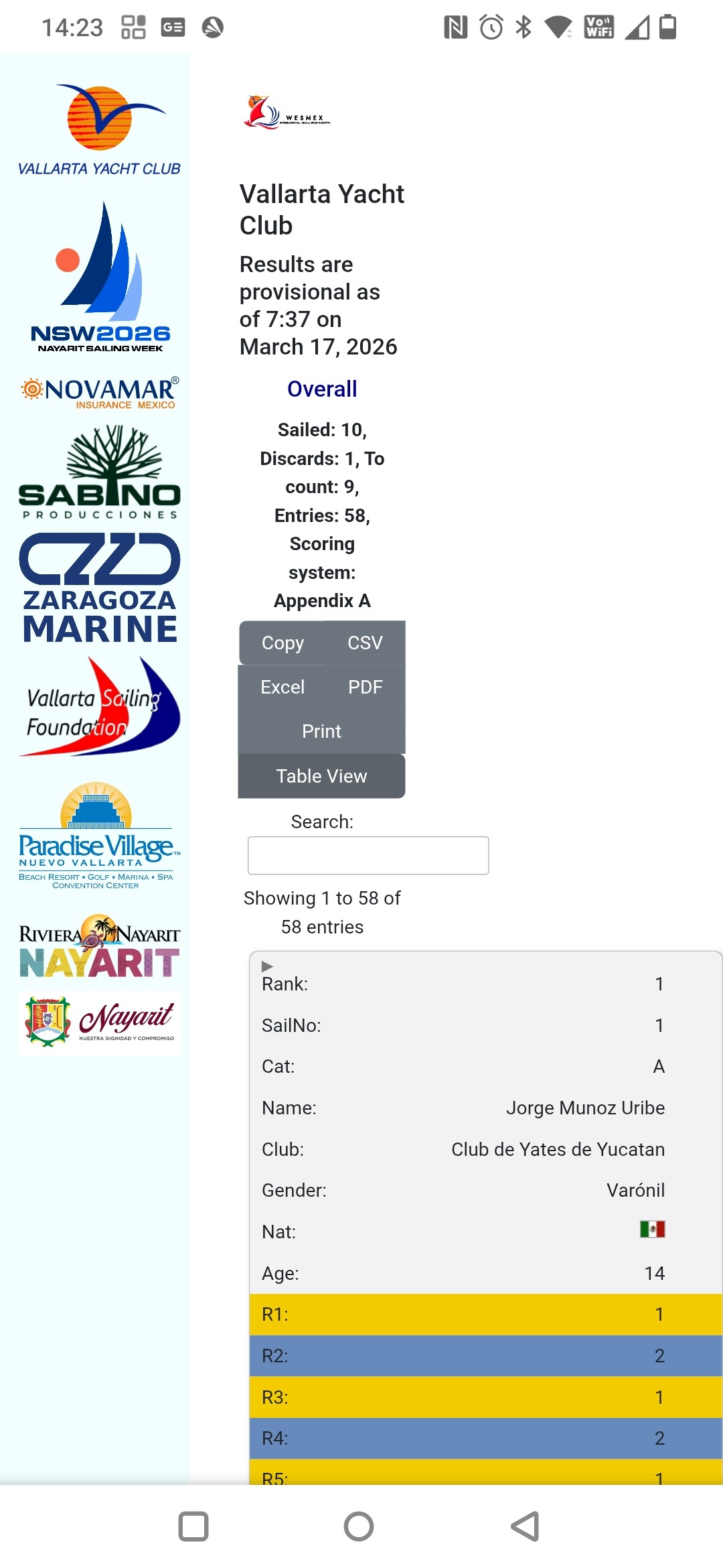
I have been working on an adaptive presentation of Sailwave results which can be seen at Sailwave results for 29er World Championships 2024 at Aarhus,Denmark<br>1st to 9th August 2024.
The above link is a hand crafted presentation which I managed to coble together from information found on the Internet. BUT I have not been able, with my poor coding skills, to do 3 things in JavaScript that would make it possible for it to become a Sailwave ‘Effect’. (edit add) There are a couple of other issues t hat would need resolving as well.
If there is a SUG member, or SUG member who has friend, who could provide necessary JavaScript skillset would be fantastic.
Kind regards,
Huw
Hi Tom,
A quick update.
A UK Sailwave user has revised & enhanced the code I cobbled together. I have asked them if they would further revise/enhance the code to work, as well, with individual race table.
Just need know to work out how to put together into files other Sailwave users can make from within Sailwave.
Kind regrds,
Huw
Hi SUG Members,
Adaptive / responsive published results that adapt / responded to different screen sizes is now working in a way that can be packaged into a Sailwave ‘Effect’.
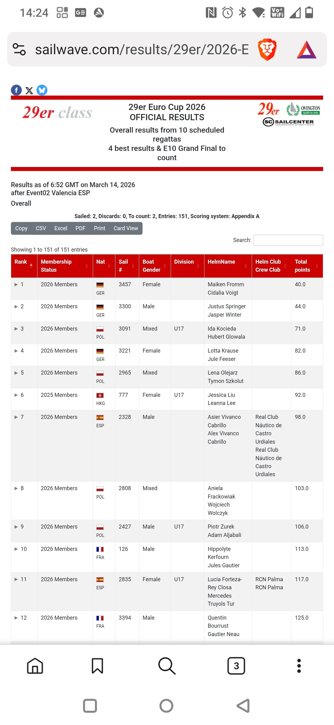
Firstly a BIG THANK YOU to John Doyle a Sailwave User here in the UK for taking the code I had cobbled together and refining it so it could be packaged as a Sailwave ‘Effect’. John created his own publishing template for a series he looks after. It can be seen at Sailwave results for TOPPER NS2 2026 - 5.3 at Weymouth & Portland National Sailing Academy 2026
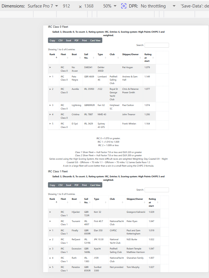
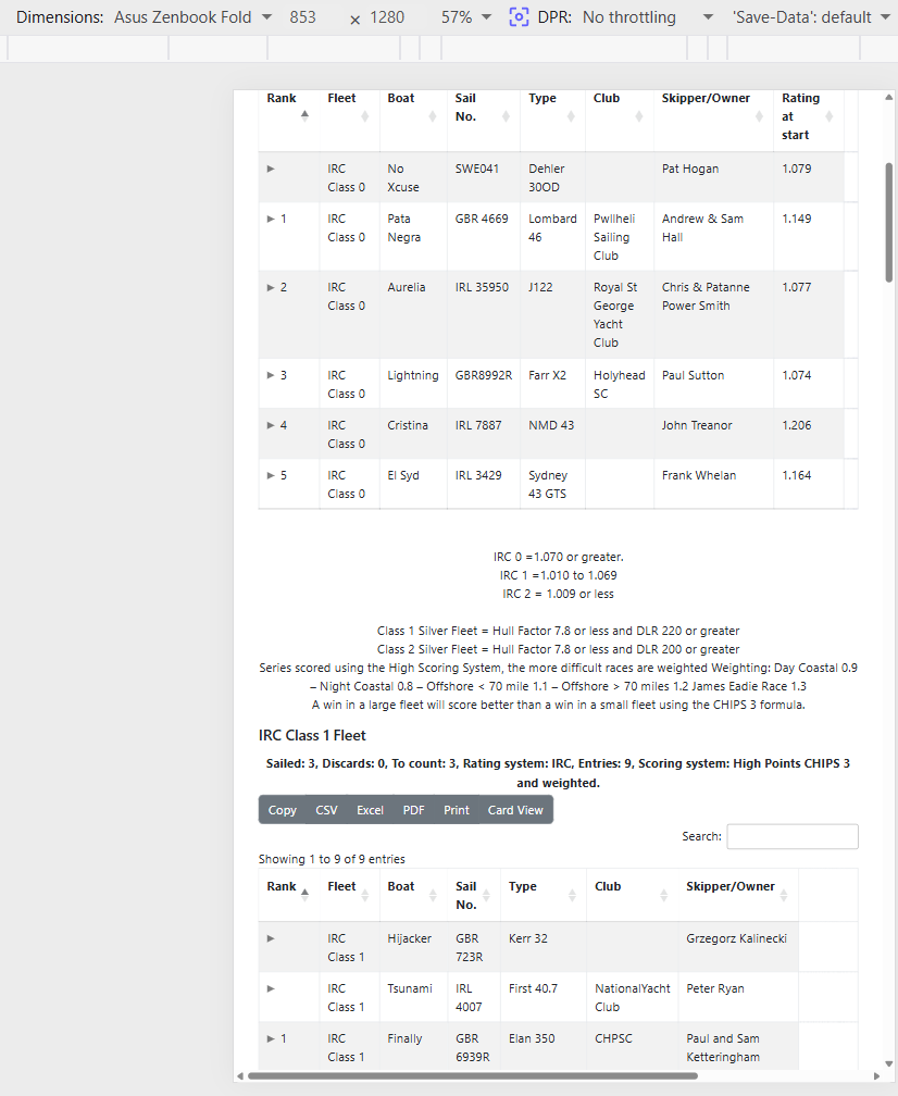
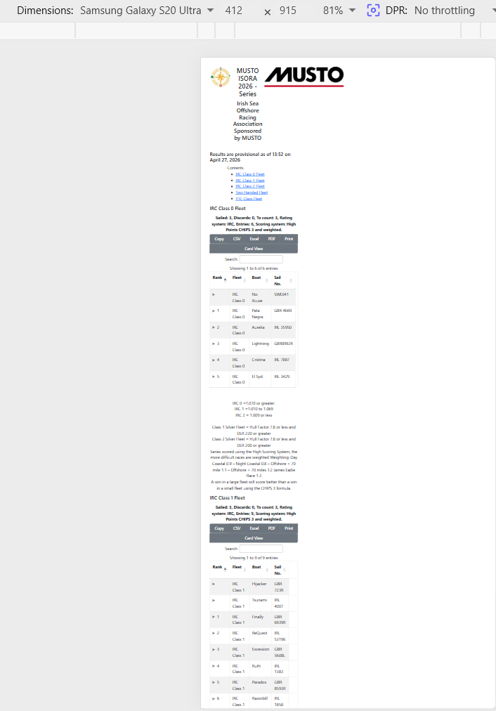
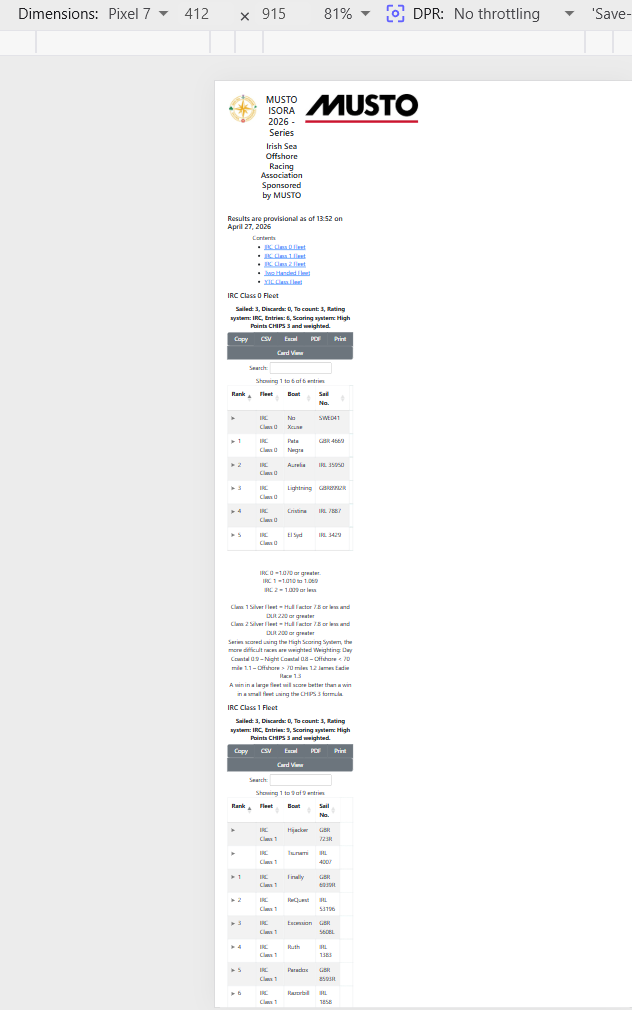
This is what the published results using the adaptive / responsive effect look like on an Android One+ 7 phone. Two different sets of results.
Information on how to get the effect and another required file coming soon 
Together with some notes.
Kind regards,
Huw
Hi SUG Members,
At last the Adaptive/Responsive ‘Effect’ teased in the previous post in this thread has been released
The information about the ‘Effect’ and the link to the ‘Effect’ can be found at Adaptive/Responsive ‘Effect’ (Huw) | Sailwave.
Kind regards,
Huw
Huw, can your provide samples so that we can better understand what is possible?
Thanks,
To Owen
Hi Tom,
I would only be able to provided screen shots as it is a dynamic effect tied to the device screen size or resizing of a browser window.
The best way of seeing what happens is to download the ‘Effect’ and put it into the Javascript folder. Then when publishing s et of results, click the ‘Effects’ button on the second publishing window and select Adaptive from the list of effects and then publish.
I posted a link to a set of results published using the ‘Effect’ in my previous post.
Kind regards,
Huw
Hi SUG Members
If you want to test the Adaptive ‘Effect’ on a PC screen you can simulate different device screen sizes using the techniques suggested by an Internet search;
To set a web browser to a specific device screen size, use the Device Mode in browser developer tools. Press F12 (or Ctrl+Shift+M / Cmd+Shift+M on macOS) in Chrome, Edge, or Firefox to open the toggle device toolbar, then select a device preset or input custom pixel dimensions for simulation.
Chrome and Edge (Chromium Browsers)
- Open the website, then press
F12(or right-click and select Inspect) to open DevTools. - Click the Toggle Device Toolbar icon (phone/tablet icon in the top-left).
- In the top viewport, select a device (e.g., iPhone 14) from the dropdown, or enter custom width/height pixels.
- Optional: Select “Add device pixel ratio” (DPR) or add custom devices via the
...menu.
Firefox
- Press
Ctrl+Shift+M(orCmd+Shift+Mon Mac) to open the Responsive Design Mode. - Choose a preset device from the top menu or enter custom dimensions.
Safari
- Enable developer tools: Go to Safari > Settings (or Preferences) > Advanced and check “Show features for web developers”.
- Select Develop in the menu bar and click Enter Responsive Design Mode.
Other Methods
- Browser Extensions: Install extensions like “Window Resizer” for Chrome to quickly change the viewport to specific resolutions.
- Web-based Tools: Visit sites like
browsersize.comto set custom dimensions. - Desktop App: Use a free utility like Sizer to resize the entire browser window to exact pixel dimensions.
Kind regards,
Huw
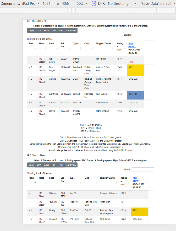
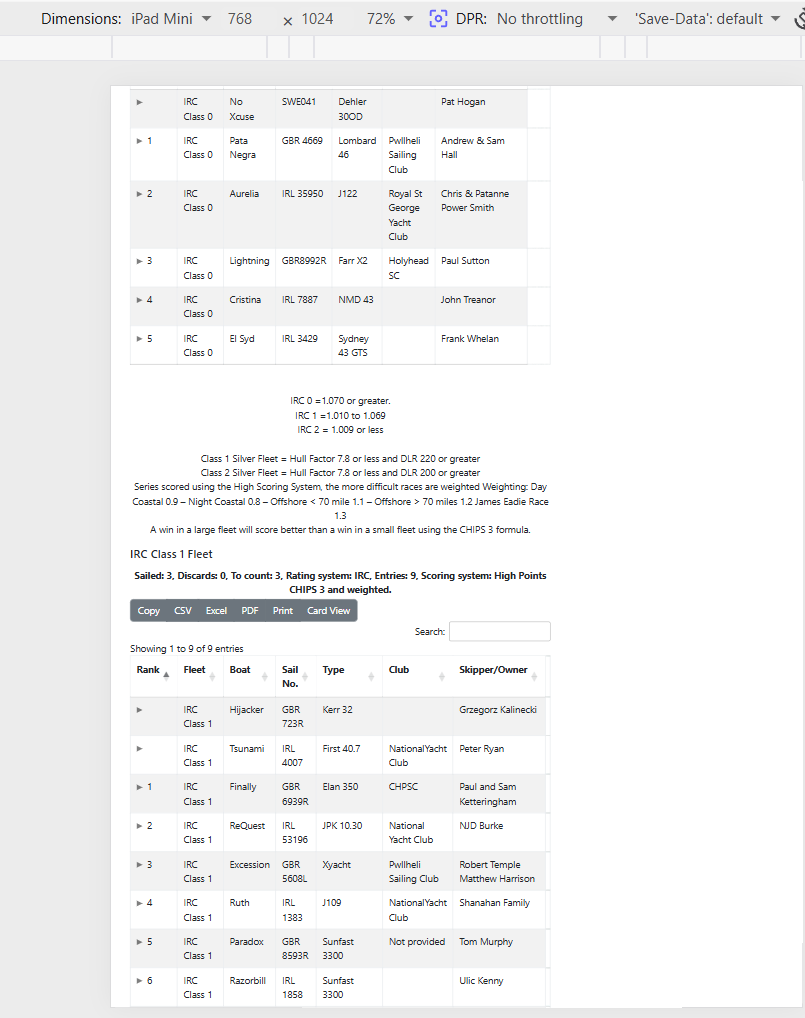
Hi SUG Members,
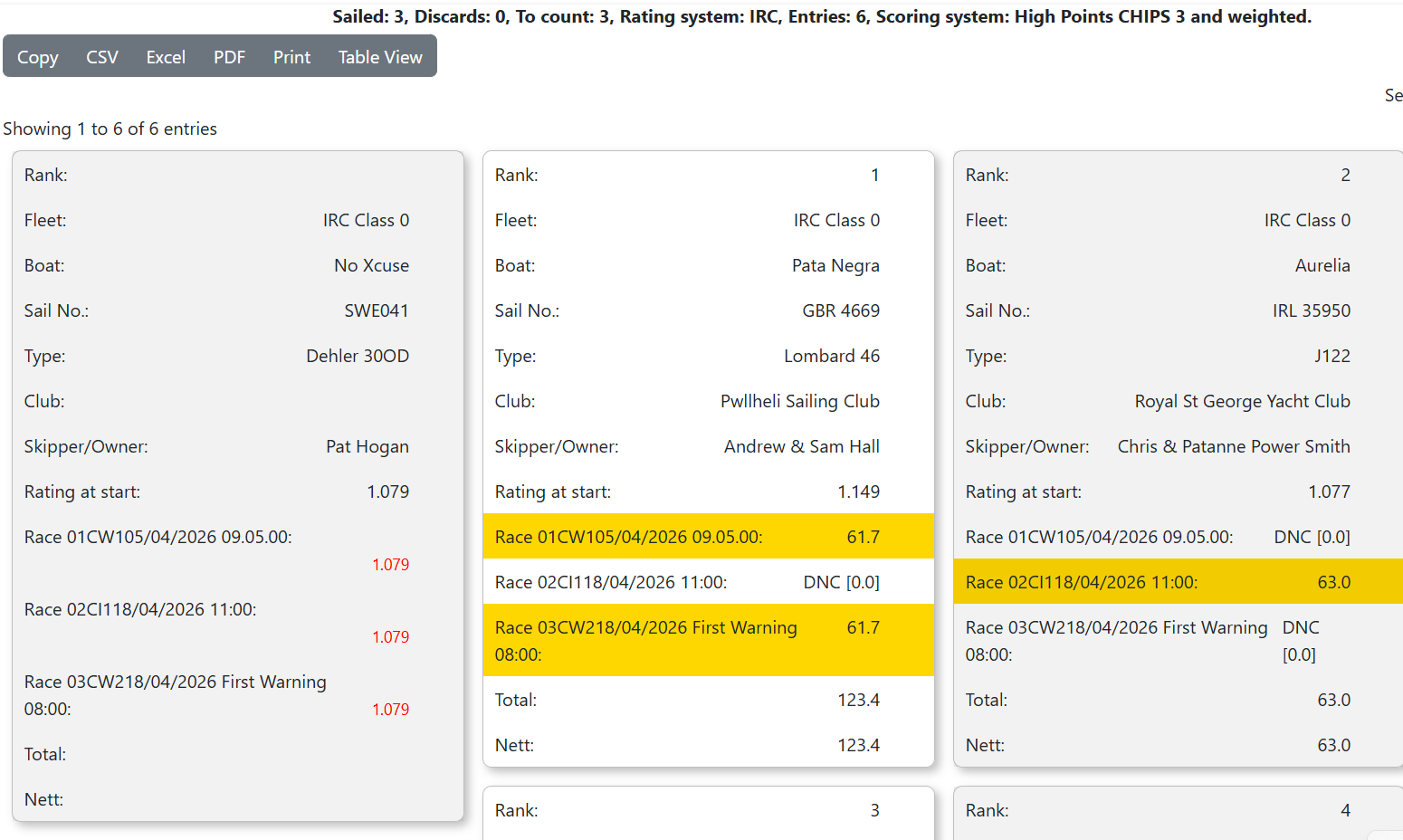
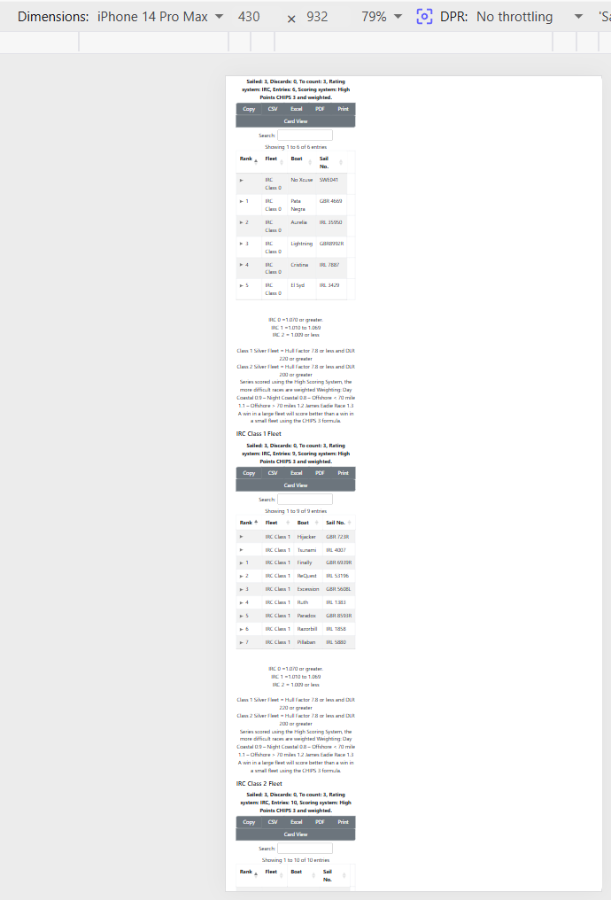
Some screen grabs of simulated Apple devices using developer tools in Brave browser. But first a screen grab of results in ‘Card view’.
iPhone14 Pro Max
iPad Pro
iPad Mini
Kind regards,
Huw